

We build tools and experiences for people.

Data Portal
One-stop portal for publishing, discovering, and accessing organizational data products.
The Data Portal is a centralized hub for all data products created and curated across the organization. It empowers employees at every level to make informed, data-driven decisions. Users can access trusted data through an intuitive, efficient interface built for high performance and enterprise-grade security. By making data discovery and consumption more accessible, the portal helps teams — from business to engineering to marketing — effectively use organizational intelligence in their daily work.


Research Topic Browser
Exploratory data visualization of research topics and projects at the ZHAW.
The Research Topic Browser offers an interactive overview of the research landscape at the Zürich University of Applied Sciences (ZHAW). The visualization maps research topics and subtopics across the institution, highlighting how they are connected and where research activity is most concentrated.

Winterthur City Dashboard
Dashboard showcasing the essential factors shaping life in Winterthur
The Winterthur City Dashboard provides citizens with a comprehensive overview of key aspects shaping life in their city. Covering topics such as population, economy, culture, environment, and public services, it offers detailed insights into the city's development. Interactive charts, maps, and statistics make complex information accessible, with a strong focus on clarity, usability, and engagement.

Cancer Monitoring Dashboard
Dashboard about the incidence and mortality of cancer for the Federal Statistical Office
The Cancer Monitoring Dashboard is the authoritative source of information about the incidence and mortality of cancer in Switzerland. The website provides the general public with detailed insights about important parameters in epidemiology to understand and observe the occurrence and development of oncological diseases with a focus on readability, usability, and accessibility.

UIS Data Browser
Data platform for viewing and visualizing the complete dataset from the UNESCO Institute for Statistics
The UIS Data Browser is the definitive source for educational, scientific, and cultural statistics managed by the UNESCO Institute for Statistics. The platform enables people to discover, visualize, and analyze a wealth of data for the Sustainable Development Goals.

Competitiveness Datahub
Data platform on Western Balkan economic competitiveness for OECD
The Competitiveness Datahub assists the six Western Balkan economies Albania, Bosnia and Herzegovina, Kosovo, Montenegro, North Macedonia, and Serbia in assessing and benchmarking their economic reforms and policies essential for competitiveness, enabling them to formulate better policies in response.

Popular Votes Dashboard
Dashboard about the results of the Swiss popular votes the Federal Statistical Office
The Popular Votes Dashboard is the authoritative source of information about the results of the federal popular votes in Switzerland. The website provides the general public with detailed insights about the results and participation on a cantonal, district, and municipal level as interactive tables, charts, and maps with a focus on readability, usability, and accessibility.

Election Dashboard
Dashboard about the results of the Swiss federal elections for Tamedia
Every four years, Switzerland conducts elections to choose new representatives for both the National Council and the Council of States. The election dashboard we created for the Tamedia provides up-to-date information before, during, and after the elections. The administration interface allows the news editors to enter trends, projections, and the final results from various sources and push them to their audience in real-time.

Child Penalty Atlas
Tracking the impact of parenthood on the careers of men and women around the world for H.E.R.
The Child Penalty Atlas maps how the arrival of a child affects the careers of men and women across the globe. This exploratory data visualization developed for the Hub for Equal Representation in the Economy (H.E.R.) at the London School of Economics highlights the research insights in an intuitive and memorable manner. Users can search, browse, and compare the observed child penalty in employment and gender gap in employment across continents and countries worldwide.

Visualize
Online tool to create data visualizations based on linked open government data from the Swiss Confederation
As part of the Linked Open Data Platform, the online tool «visualize.admin.ch» enables everyone to create interactive data visualizations based on the linked open data sources of the Swiss federal government. Visualizations can be created using a simple and guided user interface that embeds data visualization best practices to ensure that the resulting charts are effective and consistent.

Ballot Dashboard
Dashboard about the results of the Swiss popular votes for Tamedia
On four Sundays a year, the Swiss vote on federal, cantonal, and communal topics. The ballot dashboard we created for the Tamedia media group provides up-to-date information before, during, and after the vote. The administration interface allows the news editors to enter trends, projections, and the final results from various sources and push them to their audience in real-time.

Global Education Observatory
Data platform to track and monitor SDG4 progress and commitments on quality education for all for UNESCO
The Global Education Observatory is a gateway to education-related data. It builds on existing data from a range of sources, and gathers new information ensuring an exchange of information to improve the monitoring of SDG4 progress and relevant and emerging policy commitments.

Education Inequalities
Data platform on deprivation and marginalisation in access to education for UNESCO
This platform visualizes the current state of education for over 100 countries and enables you to look beyond the averages, see the disparities and identify which demographic groups are the most disadvantaged.

Data Visualization Guidelines
Design system for creating effective and consistent charts for data analysis and data reporting for Federal Statistical Office
The Federal Statistical Office has the mandate of communicating statistical results to a wide audience in an easily understandable way. To help them present data effectively and consistently, we've developed a comprehensive design system for data visualization applicable across media channels like print, online, and television. The new system was published as a living documentation of design principles, design specifications, chart templates, and more.

Electricity Prices
Detailed electricity price analysis of cantons, municipalities, and network operators for ElCom
ElCom is responsible for monitoring prices and tariffs in the electricity sector in Switzerland. To support their mission, we've designed and developed a public information dashboard where policy-makers and consumers can analyse and compare electricity prices across cantons, municipalities, and network operators.

Aurum
Data-driven interfaces and visualizations powering an isokinetic workout system.
Aurum offers an innovative workout method using the newest technologies to provide a highly customized experience. Through a data-driven application, it aims to deploy maximal effect with minimal effort. We contributed to this workout experience by designing all digital touchpoints: the training screen, coach application, and athlete dashboard.

Covid-19 Dashboard
Dashboard about the COVID-19 pandemic in Switzerland for the Federal Statistical Office
The Covid-19 Dashboard is the authoritative source of information about the epidemiological situation in Switzerland. The platform provides a diverse audience with understandable insights about the pandemic in the form of interactive tables, charts, and maps with a focus on readability, usability, and accessibility.

CYP Design System
Digital product design system for education, consulting, and innovation for CYP Association
Our client CYP is committed to creating sustainable, effective continuing education and development solutions for their customers. To support their work, we designed and developed a user interface design system that adheres to the same standards of sustainability and efficiency. It allows them to evolve their products with ease and confidence.

Cluster Data
Data visualizations highlighting the economic significance of Zurich's industry clusters for Statistical Office Canton Zürich
Clusters are industry groups that play a significant role in Zurich's economy due to the high density of companies, research and educational institutions and professional organizations. By networking the players along the value chain, the Office of Economic and Labour Affairs of the Canton of Zurich aims to increase the innovative strength of the respective clusters as well as of the various clusters among themselves.

Education Progress
Data-driven report telling the story behind education data from around the world for UNESCO
The online report «Education Progress» summarizes the key facts and trends in education around the world. It complements the information that is provided in the printed version of the Global Education Monitoring Report, the tool of the international community for the follow-up and review of progress towards a joint commitment.

Dooly
Information management platform for temporary personnel placement for maverix
Assigning the best fitting temporary workers to open job positions is a complex process for brokers of employment agencies. Dooly makes these tasks intuitive and efficient. We designed and developed a user interface design system to build a flexible and elegant information management platform.

Going Digital Toolkit
Data platform to help countries realise the promises of digital transformation for OECD
The Going Digital Toolkit helps countries assess their state of digital development and formulate policy strategies and approaches in response. In collaboration with the OECD we designed and developed an interactive data exploration portal that combines indicators, policy guidance, and publications.

Data Visualization Guidelines
Style guide and templates for creating effective and consistent charts for data analysis and data reporting for Swisscom
Swisscom analysts use Tableau to make big data visible and understandable and reveal important insights that drive the actions and decisions of internal teams and their clients. To help the organization present data effectively and consistently we established a comprehensive style guide for data visualization with instructions and best practices. Additionally, we have created a custom Tableau template with pre-formatted pages and examples of charts and compositions to support the analysts in the creation of data stories and dashboards.

Swiss Elections 2019
Data-driven report and visual analysis of the 2019 Swiss Elections for SRG SSR
A series of data-driven reporting and visual analysis around the 2019 Swiss Elections that provides valuable insights about Swiss political history, candidates and elected parliamentarians, parties and concerns of Swiss citizen.

E-Cityplan
Information and navigation system helping people getting around the city of Zürich
The E-Cityplan panels located across the city of Zürich are here to help residents and visitors explore the area around them. A dynamic and interactive map is at the heart of this service in addition to a timetable for public transportation, event, local information, and emergency advice.

Augment
Personal application to inform, motivate and empower people on their journey to better health for Biovotion
Vital signs. Medical grade. Anywhere. All the time. Biovotion's solutions connect patients and providers throughout the continuum of care. From primary to hospital and home care. Dedicated, disease specific solutions for better health outcomes.

Prices & Earnings
Interactive report on the cost of living in cities around the world for UBS
Some consumer goods are available all over the globe. To get a better understanding of purchasing power across the globe, we helped UBS create an explorable interactive index report visualizing insightful data on prices and earnings in 77 cities.

Roger Federer
Data story about the career of the legendary Swiss tennis player for SRG SSR
To celebrate Roger Federer's 20th Grand Slam title and his 20th anniversary as a professional tennis player we published this interactive data story in close collaboration with SRG SSR. The article follows the career path of the Swiss tennis player and our analysis of his performance reveals how he became the best male tennis player of all time.

Violence Info
Global knowledge platform about violence prevention for the World Health Organization
Violence Info is a collection of current, published scientific information on interpersonal violence. It provides information on the prevalence of violence, its consequences, risk factors, prevention and response strategies. The data for each category of violence is analyzable through various visualizations to present a more accurate picture of the magnitude, severity, and consequences for individuals and society.

TomCast
Platform for collaborative forecasting of global financial markets for Tom Capital
TomCast is a research tool for financial market forecasts that allows tracking and analyzing published forecasts to understand their quality. We designed and developed an initial version of the product in close collaboration with the client and continue to support them in developing their product's strategy so they can reach their vision of a collaborative approach to forecasting.

Lobbywatch
Research platform for transparent political and economical interests
Lobbywatch is a research platform for journalists which sheds light on the interests between the Swiss national and state councils and companies. Our redesign simplifies the search for and analysis of people, organizations, and lobby groups.

Explora
Publication for visual storytelling about scientific materials and topics for the ETH Library
The ETH Library has an impressive and extensive archive of rare books and provides an infrastructure for the medium and long-term storage of digital data. To make these resources and services more accessible to the public we designed and developed Explora. This mobile-first website holds a series of carefully curated articles which are published by the ETH Library staff on a quarterly basis.

Ava
Health data visualization for tracking cycle, fertility, and pregnancy
The Ava bracelet and application allows women to effortlessly track nine different physiological parameters. To transform the collected data into insights, we designed a new statistics and analysis page for the mobile application which includes compelling yet simple-to-read data visualizations.

Wellbeing in Germany
Data-driven report on the wellbeing of citizens for the German Government
To conclude a two year long study, the German Government commissioned us to create a digital report presenting the gathered facts and gained insights. A total of 46 indicators grouped in 12 dimensions document the current state and future trends of wellbeing in Germany.

Flynt
Digital wealth management platform connecting the dots of complex wealth structures
Flynt's wealth management platform provides users with a holistic view of their wealth ecosystem. We helped to design and develop an initial version of the application, always with the goal to put the client in the center and to communicate even complex concepts in a simple an understandable way.

Cockpit
Personal data management and analysis application for Swisscom
The Swisscom Cockpit gives their users detailed insights and full control over their costs when they use mobile data and make calls. We designed and implemented a responsive frontend that´s easy to use and accessible across all mobile devices.

Swiss Elections 2015
Data-driven report and visual analysis of the 2015 Swiss Elections for SRG SSR
A series of data-driven reporting and visual analysis around the 2015 Swiss Elections that provides valuable insights about Swiss political history, trends, the mechanics of the electoral system in Switzerland and the candidates.

Gemeinwohl Atlas
Data platform on the public value generated by organizations for the University of St.Gallen
Within the scope of a research project by the University of St. Gallen we designed and developed an interactive atlas to discover the public value of Swiss and German organizations.

Competence Browser
Network visualization of research activity and competences for ZHAW
The exploratory network application we created for the Zurich University of Applied Science interconnects the competences available in the various institutes of the university. Competences are clustered into topics and subtopics allowing you to zoom from a bird's eye view down to the very details with ease.
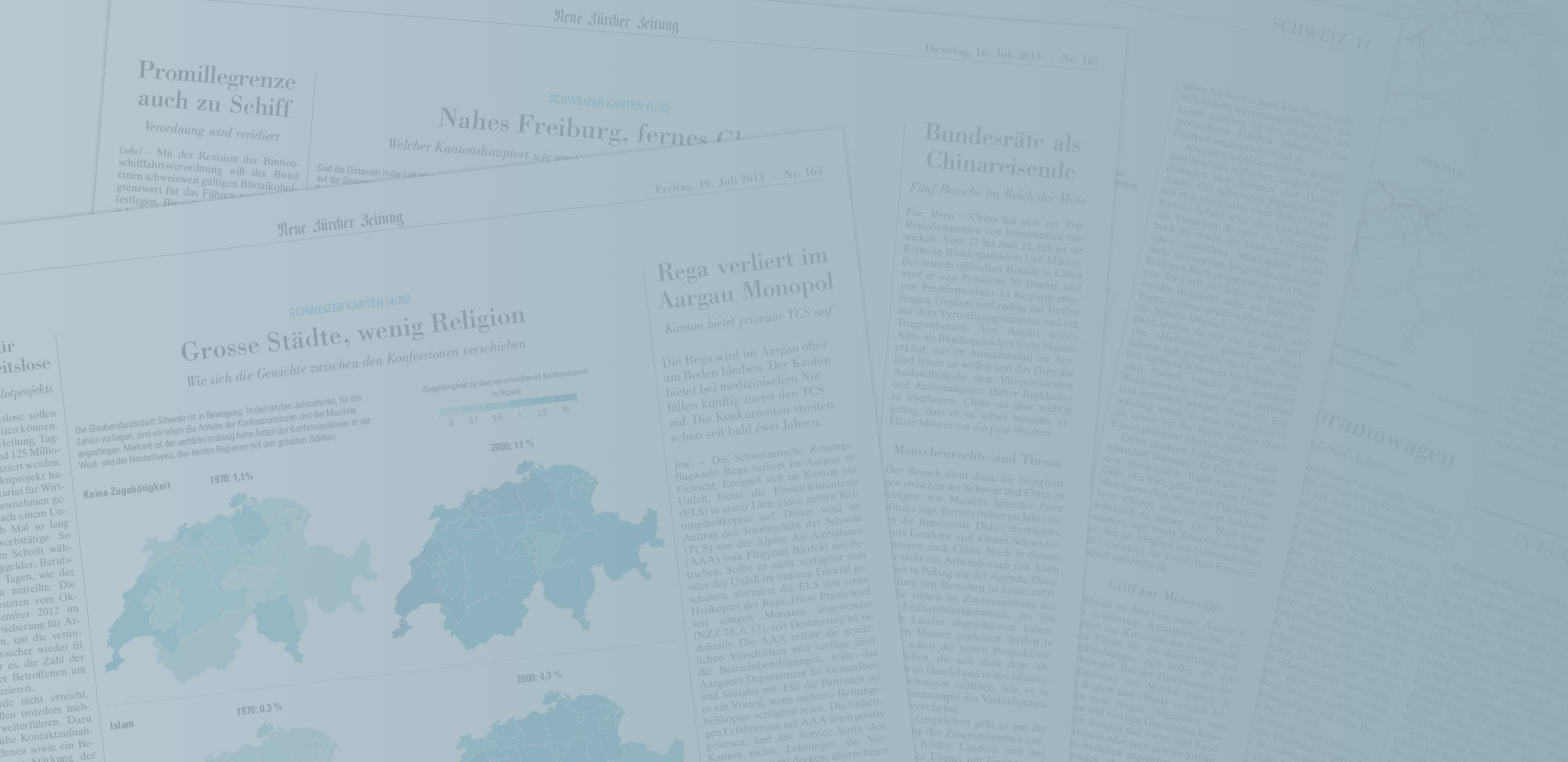
Swiss Maps
Visual and interactive stories about the truths and myths surrounding Switzerland for NZZ
For the Swiss newspaper Neue Zürcher Zeitung we created a series of 20 visualizations covering various topics related to national relevance, including the municipal disparity of electricity rates, the population development over the last 40 years and the flow of migration between the cantons. The visualizations have been essential part of a journalistic series and were optimized for desktop, mobile and print.

Iouri Podladtchikov
Long-form and interactive portrait of the Olympic gold medalist for NZZ
As part of an extensive online coverage about the Swiss snowboarder Iouri Podladtchikov for the 2014 Winter Olympics in Sochi, we helped the Neue Zürcher Zeitung create and implement an interactive portrait to show all his talents.

Social Progress Index
Data platform on the global social and environmental progess for Social Progress Imperative
The Social Progress Index measures the extent to which countries provide for the social and environmental needs of their citizens. Researchers, policymakers and journalists can explore, evaluate, and compare the performance of over 50 countries in the different areas of social progress.

Fukushima
Long-form and data-driven report about the humanitarian crisis in Fukushima for NZZ
Together with the Swiss newspaper Neue Zürcher Zeitung, we tell the story of people affected by the happenings in Fukushima in March 2011. We designed and implemented a media-rich reading experience that attempts to paint an accurate picture of the humanitarian situation two years after the triple catastrophe.

Ecoplace
Smart home dashboard to facilitate sustainable and mindful energy consumption for AXA
The pilot housing project called Ecoplace in Zürich offers its residents sustainable living in a convenient environment. Using intelligent technology, the daily consumption of water, electricity and heat is tracked for every apartment. The reporting tool we designed and developed visualizes this data to give residents immediate feedback and motivates them to adjust their behavior – always with the goal to reduce consumption to a minimum.

Ville Vivante
Data visualization of citizen's mobile network usage over time and location for the City of Geneva
In collaboration with Lift and Near Future Laboratory, we visualized the digital traces left by people´s mobile phones in the city of Geneva. The animation and eight posters were shown near Geneva central station from February 20th to March 4th 2012.
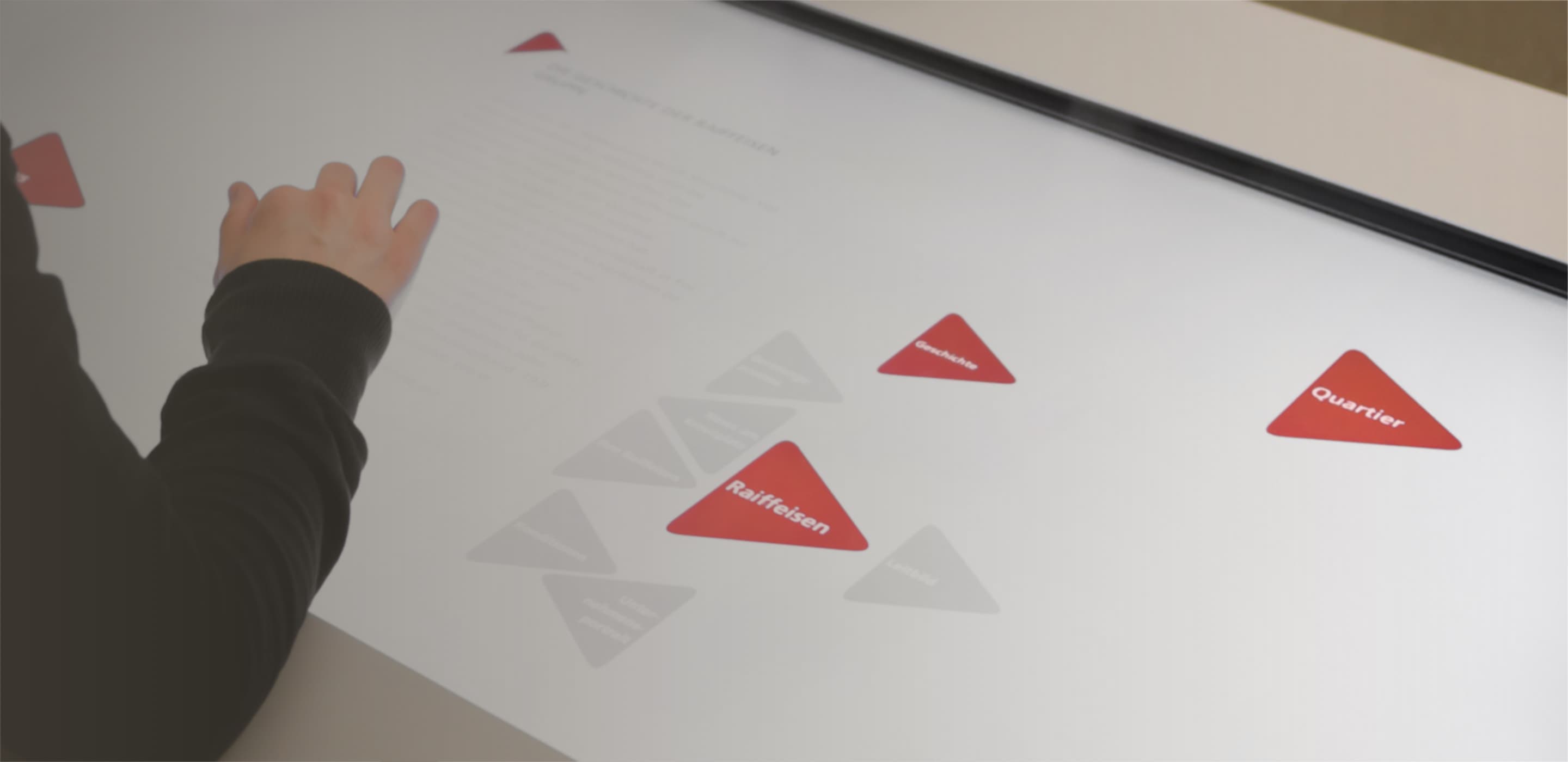
Media Table
Touchscreen for bilateral advisory and independent research for Raiffeisen
In collaboration with iart interactive we developed the user interface of an interactive media table for Raiffeisen. The user interface's visual design specifically matches surrounding scenography and Raiffeisen's corporate identity. It is dynamically generated from the underlying content and reacts organically to the user's interactions.
Interested in working with us?